In today’s world, a simple plate of avocado toast gets more attention than a big political debate. Your visual identity is more than just pretty pictures. It’s your culinary statement.
This isn’t just about food branding. It’s about the special language of food. A good visual system can say “artisanal” or “comfort” before you even take a bite.
Think of it like your restaurant’s outfit for every day. That logo, color scheme, and photography style? They’re not just for show. They’re non-verbal orators for your whole philosophy.
Celebrity chefs didn’t just rely on butter to build their empires. They became known as personalities. Their visual tools tell a story, making food more than just something to eat.
Ready to go from being a cook to a creator of experiences? Your journey starts here.
Components of Visual Branding
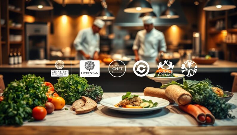
Visual branding for chefs is a team effort. Your chef logo is the main attraction, but it’s part of a larger show. Each element is vital for a cohesive look.
Gordon Ramsay’s empire is a perfect example. It’s not just a logo; it’s a whole experience. From the Hell’s Kitchen set to his social media, it all fits together. Your visual brand should be a seamless ecosystem.
So, what makes up this orchestra? There are ten key elements. The table below is your guide to visual harmony.
| Component | Its Role in Your Visual Brand | Key Platforms/Examples |
|---|---|---|
| Logo | The signature, the core symbol of your identity. | Website, packaging, social profiles, merchandise. |
| Website | Your digital flagship; the home where style meets substance. | Desktop and mobile site, online booking, menu display. |
| Brand Messaging | The voice and story that give your visuals meaning. | Taglines, “About Us” copy, menu descriptions. |
| Product Packaging | The silent salesman on the shelf; tactile and visual appeal. | Jars, bottles, boxes, takeout containers. |
| Brick & Mortar | The 3D immersion into your brand’s world. | Restaurant decor, signage, uniforms, table settings. |
| Social Media | The daily visual conversation with your audience. | Instagram grid, TikTok videos, Facebook posts. |
| Email Marketing | The direct visual line to your loyalists’ inboxes. | Newsletter templates, promotional graphics. |
| Advertising | Paid amplification of your visual story. | Digital ads, print media, local sponsorships. |
| Content Marketing | Demonstrating expertise through branded visuals. | Blog graphics, recipe videos, tutorial imagery. |
| Merchandise | Turning customers into walking billboards. | Aprons, t-shirts, hats, kitchen tools. |
Notice the pattern? It’s all about being consistent across all platforms. Your website colors should match your packaging. Your menu photos should look like your social media.
This approach turns chefs into lifestyle brands. Martha Stewart is a great example. She’s not just a chef; she’s a symbol of home life. Your Marketing & Branding will succeed when these elements work together. For more on building your visual brand, check out this guide.
Get this right, and your chef logo becomes a trusted symbol. It’s recognized everywhere, online and offline.
Designing Your Logo
Creating a chef logo is more than just drawing a sandwich. It’s about putting your culinary promise into a single, memorable mark. It’s like your coat of arms in the food world. Will it be simple and exclusive, or welcoming and fun? The choice is interesting.
Good culinary branding focuses on space and promise. It’s about showing your values, not just your food. For example, Burger King shows a burger, while a boutique bakery uses a more abstract logo. Your logo should share your promise quickly.
![]()
Shape psychology is key. Circles mean community and tradition, like a bakery’s logo. Angles suggest innovation and precision. The best logos use negative space to make the icon memorable.
Typography is also important. Using a default font is like wearing sweatpants to a fancy event. Custom fonts show you’re unique. Serif fonts can mean heritage, while sans-serif fonts are modern.
Your chef brand colors also play a role. They prepare the viewer’s emotions. Earthy tones mean organic food, while red means passion. Your chef logo colors set the mood before you even talk about your food.
So, how do you mix it all? The icon, type, and chef brand colors? The secret is simplicity. A cluttered logo is confusing. Aim for something simple yet rich with meaning.
Your chef logo is a mix of shape, type, and color. It’s your flag in the culinary world. Make sure it’s worth noticing.
Choosing Brand Colors
Your brand colors are the first thing your customers see. They set the tone before they even taste your food. It’s not just about picking a favorite color for your business card. It’s about using colors to send messages to your customers.
Think of color as your brand’s silent helper. It gets your customers ready for what’s to come. It hints at quality, trust, and a desire for more. Get it right, and you’ve already won half the battle in Marketing & Branding.
Why do fast-food giants use red and yellow? It’s not because they lack creativity. It’s because these colors affect our biology. Red makes us feel energetic and passionate. Yellow makes us feel happy and warm. Together, they’re like a dinner bell calling us to eat.
If your brand is calm and natural, green is your best friend. It tells people your food is organic and fresh. It’s like saying your food is made from the best ingredients.
Warm colors like red, orange, and yellow make us hungry. They’re perfect for brands that are bold and comforting. Natural colors like green, beige, and brown tell a story of quality and care. They make us think of fresh ingredients and careful preparation.
Blue is different. It makes us feel calm and trustworthy. But it also makes us less hungry. Using blue as your main color can be risky, unless you’re selling something cool and modern.
Your color palette must be thoughtful. If you’re a chocolate brand, use deep browns and golds. If you’re a salsa brand, use bright reds. The key is to choose colors that do something for your brand.
Let’s look at how color psychology works for food brands:
| Color | Psychological Trigger | Best For Conveying | Considerations |
|---|---|---|---|
| Red | Energy, urgency, appetite stimulation | Bold flavors, passion, fast-casual concepts | Can feel aggressive if overused; pair with neutrals. |
| Orange | Fun, affordability, warmth | Family-friendly brands, value, approachability | Use vibrant shades sparingly to avoid a “cheap” feel. |
| Yellow | Happiness, optimism, clarity | Breakfast items, lemon-based goods, cheerful brands | Bright yellows can be straining; mustard or gold tones add sophistication. |
| Green | Health, freshness, natural origins | Organic produce, plant-based, sustainable practices | Dark greens feel premium; light greens feel fresh and clean. |
| Blue | Trust, calm, stability | Seafood, artisanal water, tech-forward food services | Major appetite suppressant; best as an accent, not a primary food color. |
| Brown | Earthiness, richness, reliability | Artisan coffee, chocolate, baked goods, rustic cuisine | Can feel drab; combine with cream or gold for luxury. |
| Beige/Cream | Purity, simplicity, artisan quality | Bakeries, fine dining, minimalist brands, organic packaging | Requires a strong logo or accent color to stand out. |
Choosing your chef brand colors is a science. It’s about knowing how colors affect us. That bright red isn’t just a color; it’s a signal for ripe fruit. That green isn’t just a color; it’s a promise of something natural.
Your colors should make your food look good in photos. They should make your brand feel real at first glance. This is mood marketing, not just picking colors. Your colors work even when you’re not around. Choose them like you would choose a key ingredient for success.
Consistency in Visuals
If your logo is fancy but your Instagram looks messy, you have a problem. Marketing & branding is about making every part of your brand look good. This means your menu, website, and social media all need to match.
Good branding is like a promise to your customers. They expect the same quality everywhere. If you don’t deliver, they’ll lose trust fast.
Celebrity chefs like Thomas Keller know how to keep their brand consistent. Whether you’re at The French Laundry or buying his cookware, it all looks the same. This is not by accident. It’s a well-thought-out plan.
To achieve this, you need to be organized. You can’t just wing it.
- Create Templates: Set up standard designs for social media, emails, and menus. This keeps your look consistent.
- Define an Image Style Guide: Decide on the style of your photos and what filters to use. Write it down.
- Control the Touchpoints: Check everything. Your store, uniforms, and website should all match.

Being strict with your visuals makes your brand strong. It turns your look into something people recognize. When someone sees your post, they should know it’s you right away.
Today, people see your brand on many platforms before visiting. If your brand looks different everywhere, it can hurt your sales. Why would someone spend a lot on your menu if your social media looks bad?
Your goal is to create a visual system that supports itself. Your marketing & branding should make your brand feel natural and not random. This is what makes your brand last, not just a trend.
Tips for Food Photography
The difference between a forgettable post and a viral sensation often comes down to three things: light, composition, and story. In the digital world, your food’s look is everything. It’s not just about taste; it’s about visual appeal. Your chef photography is key to grabbing attention.
But don’t just stick to the basics. A simple photo of a plate won’t cut it. You need to tell a story with your shots. Is that sauce drizzle dramatic? Does the steam from the bowl invite you in? This is where food photography meets art.
Think about this: shots of a chef’s hands can get 340% more engagement than a final dish photo. Why? It’s the process that connects us. The cracked egg, the floured board, the focused chef—these images tell a story of hard work. They build anticipation and authenticity, which is priceless for your Marketing & Branding.
To master this, you need to worship the holy trinity of food photography.
Lighting is your best friend, and natural is your soulmate. Avoid harsh overhead lights; they kill the appetite. Opt for soft, diffused window light instead. It enhances textures and makes food look fresh. Morning light is warm, while afternoon light is clear. Learn their moods.
Composition is where you play god. The rule of thirds is just a guideline. Place your main subject off-center. Use leading lines to guide the eye. Negative space adds depth, making your dish stand out. A messy, asymmetrical setup can feel more alive than a perfect one.
Styling is the whispered secret. A well-placed crumb suggests a recent bite. A folded napkin implies a return visit. A drizzle of oil should look accidental, not planned. These details scream “real” in a world of fakes. Your styling tells the audience, “This is not just food; it’s an experience.”
Is your chef photography doing enough for your brand? Does it just document or does it seduce? In a crowded feed, you’re up against cat videos and vacation pics. Your image must stop the scroll, tell a story, and promise a feeling. That’s the true power of visual Marketing & Branding.
Hiring Professionals vs. DIY
Choosing between a pro and DIY is like picking between a Michelin-starred kitchen and a food truck. Both have their place, but only one can grow. Your chef logo and chef photography are key assets, not just decorations. So, do you hire a master or try to do it yourself?
Let’s look at the options. On one side, you have AI logo makers and template galleries. They’re like IKEA furniture: cheap, easy to put together, and works well. They’re great for starting out or for social media.
On the other side, top chefs spend big on professional teams for design and media. They know that good chef photography makes food look real. A good chef logo must be clear and grow with your brand.
Here’s a simple cost-benefit analysis to help you decide.
| Aspect | DIY Approach | Professional Hire |
|---|---|---|
| Initial Cost | Low to zero (templates, AI tools) | Significant investment |
| Time Commitment | High (your labor is the resource) | Low (you manage, they execute) |
| Uniqueness & Trademark Legal | Low (generic, used by others) | High (custom, legally protectable) |
| Quality & Polish | Variable (skill-dependent) | Consistently high (expertise-driven) |
| Long-term Scalability | Poor (often needs redoing) | Excellent (built for growth) |
When does DIY make sense?
- Brainstorming initial logo concepts.
- Creating daily social media content.
- Testing visual styles on a minimal budget.
Think of it as your culinary sketchpad.
When do you need a professional?
- Designing your flagship, core chef logo.
- Photographing your signature dishes for a menu or website.
- Creating packaging, signage, or any asset that defines your public face.
This is like commissioning a custom chef’s table, not assembling flat-pack furniture.
The verdict? DIY is good for the early stages of your chef career. But when you aim for the top, a professional is essential. Your visual brand is the first bite; make it unforgettable.
Conclusion
Your visual branding is more than just decoration. It’s the heart of your culinary business. Think of it as the roux in your gumbo—without it, everything falls apart.
This isn’t about hoping for a viral moment. It’s about building a lasting legacy. Your chef logo, brand colors, and photography tell a single, compelling story.
Smart marketing & branding know that people taste with their eyes first. In a crowded market, your visual identity is your strongest argument.
Forget fleeting trends. Create a visual world that stands out. When someone craves an experience, your name should be the first they think of. That’s the power of deliberate marketing & branding.
Now, go make something memorable. The canvas is yours.